

Welcome to FullStack HR, and an extra welcome to the 9 people who have signed up since last week.
If you haven’t yet subscribed, join the 11500+ smart, curious HR folks by subscribing here:
Curious to learn more about Claude Cowork and ChatGPT Work?
I run the third cohort of the popular Cowork for HR starting on the 27th of August.
Three sessions, and the first 10 to sign up get a 30-minute private coaching session with me.
In Sweden, we have a saying. Don’t cross the bridge to get water.
And that is very applicable when it comes to working with AI, in many different ways, but we’re going to talk about one very specific way today- meta-prompting.
When you meta-prompt, you let the AI do the work for you, and how I usually do that depends a bit on the task I have in front of me, but I’m going to show you both ways.
Let’s get to it!
Help me with this.
This is a fairly easy yet powerful one; I run this whenever I’m in a slight time hurry but still want good results. What I’m doing here is letting the AI do the heavy lifting and creating the prompt for me.
The more you describe what you want the AI to do, the better. If it’s about anything related to a document you have, be sure to upload the document as well.
So, for example, if you want to create a dashboard that visualizes your employee engagement data, make sure you upload the data set.
Let’s see how a meta prompt would look in that instance.
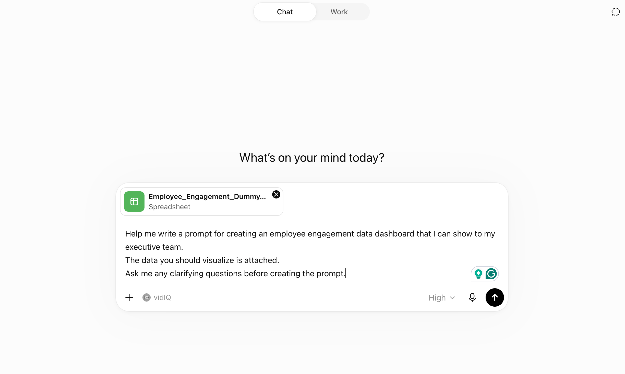
Help me write a prompt for creating an employee engagement data dashboard that I can show to my executive team.

The data you should visualize is attached.

Ask me any clarifying questions before creating the prompt.
In ChatGPT, this would look like this (and it would look very similar in whatever tool you are using as well).
And sure enough, it’s following instructions!
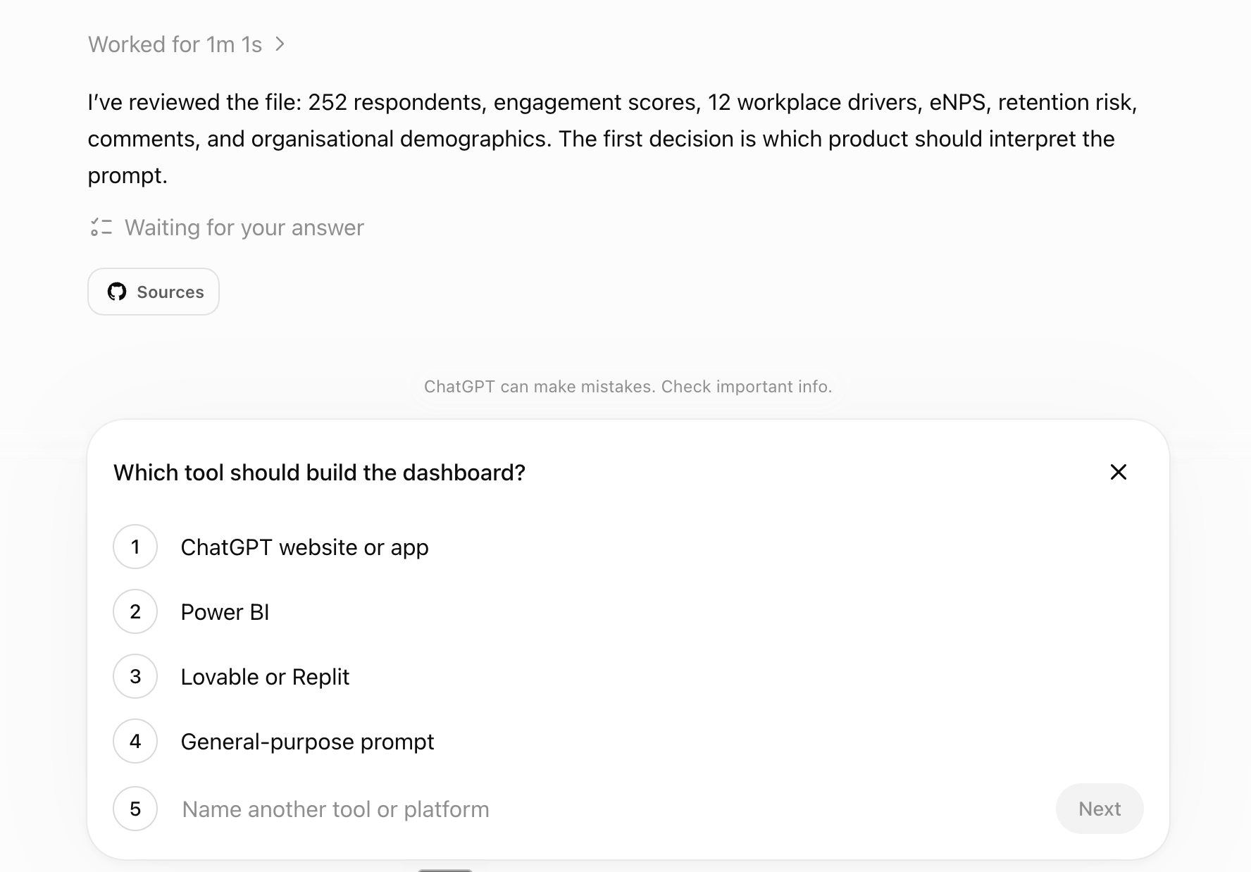
Instead of using the proposed answers, you can also give your feedback and guidance on what you want.
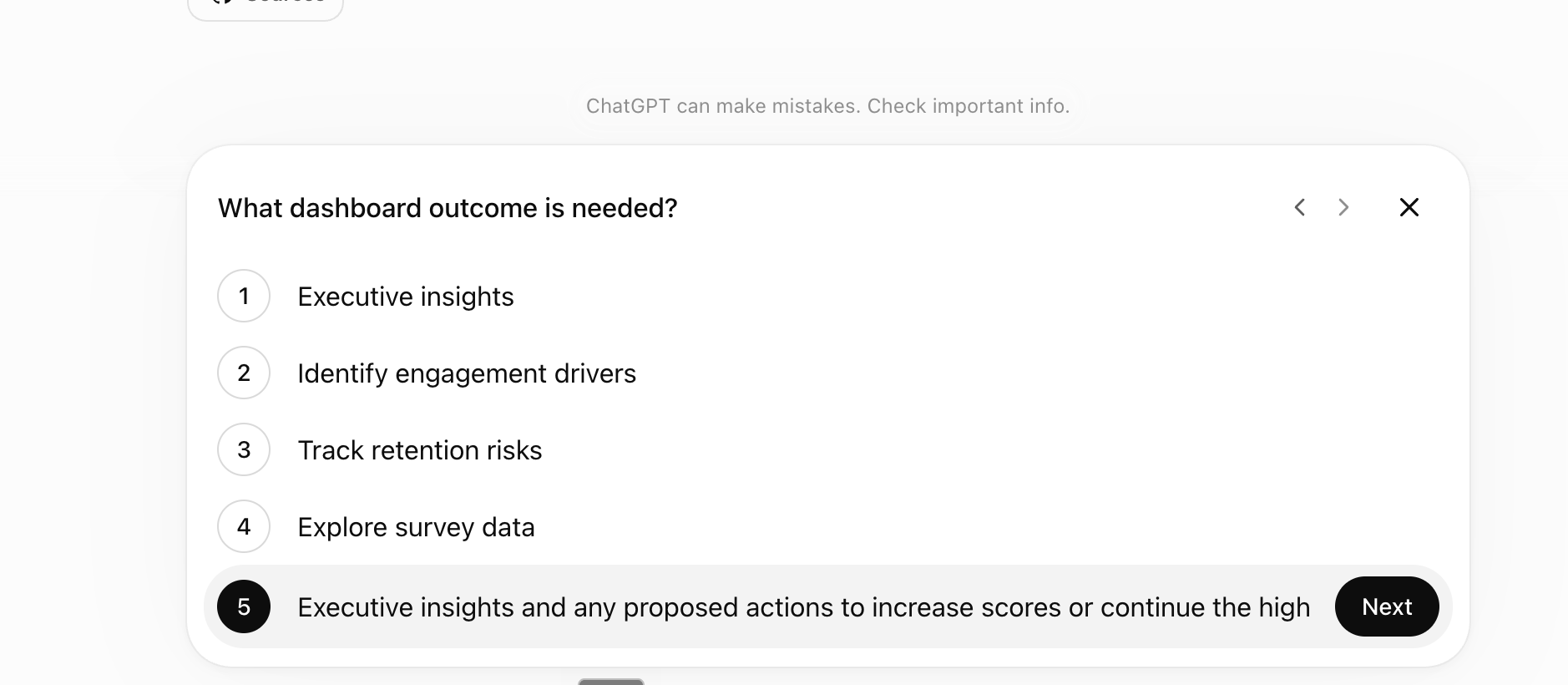
After you’ve answered all the questions, the AI will give you the prompt.
In this case… the prompt is long (which it usually is when meta-prompting like this)
Create a polished, interactive employee engagement dashboard as a working web app using the attached Excel workbook.

## Purpose

The dashboard will be presented to an executive leadership team. It should help them quickly understand:

1. The overall state of employee engagement.
2. Where the organisation is performing well.
3. Where intervention is most needed.
4. Which workplace drivers are associated with engagement, advocacy and retention.
5. What concrete actions leadership should consider.

The tone must be executive, concise and evidence-based. Avoid HR jargon, generic advice and unnecessary detail.

## Data source

Use the attached Excel workbook.

Use:

* `Raw Data` as the primary analytical source.
* `Survey Items` for question definitions, constructs and scales.
* `README` for methodology and responsible-use notes.
* The existing `Dashboard` sheet only as a calculation cross-check. Recalculate all results directly from `Raw Data`.

The file contains 252 synthetic respondents from Nordholm Systems AB.

Do not invent historical data, benchmarks, response rates or external comparisons. There is only one survey wave, so do not create trend charts.

## Build requirements

Create a fully functioning, responsive single-page web application, not a static image or wireframe.

The main view should be suitable for presentation on a 16:9 executive meeting screen. Allow users to explore further without making the initial view crowded.

Include an option to upload a replacement Excel file using the same data structure so the dashboard can be reused.

All filters, calculations, charts and narrative insights must update dynamically.

## Executive overview

At the top, show six compact KPI cards:

* Number of respondents
* Engagement index, scale 0 to 6
* Driver index, scale 1 to 5
* eNPS
* Average intent to stay, scale 1 to 5
* Percentage flagged as at risk

For each KPI:

* Show the value clearly.
* Show the scale where relevant.
* Include a brief plain-language interpretation.
* Do not label a score as good or bad using an invented benchmark.
* When filters are active, clearly indicate the filtered sample size.

Below the KPI cards, generate a concise executive summary containing no more than five sentences:

* Overall situation
* Most important concern
* Strongest organisational asset
* Most important segment difference
* Recommended leadership focus

The summary must update when filters change.

## Main dashboard sections

### 1. Engagement overview

Show:

* Distribution across Highly engaged, Engaged, Neutral and Disengaged
* Average Vigor, Dedication and Absorption scores
* The number and percentage in each engagement band

Use a horizontal stacked bar or similarly compact visual. Avoid pie charts.

Explain that the engagement score uses a 0 to 6 scale.

### 2. Organisational comparison

Create a sortable comparison table or horizontal bar chart by department.

Include:

* Respondent count
* Engagement index
* Driver index
* eNPS
* Intent to stay
* Percentage at risk
* Difference from the company average

Allow the user to switch the grouping between:

* Department
* Team
* Location
* Work arrangement
* Job level
* Tenure band

Clearly display sample size beside every group.

Do not automatically interpret small differences as meaningful.

### 3. Engagement drivers

Display all 12 driver scores ranked from lowest to highest:

* Manager support
* Recognition
* Role clarity
* Influence
* Development
* Team support
* Psychological safety
* Workload manageable
* Work-life balance
* Change clarity
* Meaning at work
* Tools and resources

For each driver, show:

* Average score on the 1 to 5 scale
* Difference from the overall driver average
* Correlation with Engagement Index
* Correlation with Intent to Stay
* Correlation with Recommend 0 to 10

Use Pearson correlation and label it clearly as an association, not evidence of causation.

Add a driver-priority matrix:

* Horizontal axis: average driver score
* Vertical axis: correlation with Engagement Index
* Label every driver
* Distinguish between potential priorities, strengths to protect and lower-priority issues
* Explain the logic in one short sentence

Do not use a single unexplained composite score. Leadership should be able to see whether something is a priority because it scores poorly, is strongly associated with an outcome, affects many people or appears repeatedly in comments.

### 4. What requires attention

Create a section titled **Leadership priorities**.

Identify the three most important issues using a balanced assessment of:

* Low driver scores
* Associations with engagement, eNPS and retention
* Percentage of employees affected
* At-risk concentration
* Comment-theme frequency
* Organisational segments where the issue is most pronounced

For each priority, provide:

* The issue
* The evidence
* The groups most affected
* A concrete proposed leadership action
* A suggested executive owner or function
* The first practical next step
* One leading indicator to monitor
* One employee-outcome measure to monitor

Recommendations must be specific to the data. Do not provide generic recommendations such as “improve communication” without describing what leaders should actually change.

Separate organisation-wide actions from local department or team actions.

### 5. What should be protected

Create a section titled **Strengths to protect and scale**.

Identify the three strongest aspects of the employee experience based on:

* High scores
* Positive relationships with engagement or retention
* Consistency across departments
* Positive comment themes
* Strong results in particular organisational groups

For each strength, explain:

* Why it matters
* Where it is strongest
* What leadership should continue doing
* How the organisation could learn from strong groups without assuming that their practices caused the result
* A warning sign that would indicate the strength is weakening

### 6. Retention and advocacy

Show:

* Promoter, Passive and Detractor distribution
* eNPS by organisational group
* Intent-to-stay distribution
* At-risk percentage by organisational group
* Groups combining lower engagement, negative eNPS and higher risk

Do not expose individual respondents or Manager IDs.

### 7. Employee comments

Analyse `Comment_Theme` and `Open_Comment`.

Show:

* Number of non-empty comments
* Theme frequency
* Positive and negative themes
* How themes differ across departments
* Whether qualitative themes support or contradict the quantitative findings

Do not show a long comment feed on the executive homepage.

Provide a separate expandable comments section with a small number of representative anonymised comments. Do not show comments from groups below the confidentiality threshold.

Do not claim sentiment accuracy beyond what can reasonably be inferred from the text.

## Filters

Include compact filters for:

* Department
* Location
* Work arrangement
* Employment type
* Job level
* Tenure band
* Age band
* Gender

Include a prominent **Reset filters** button.

Filters should update the complete dashboard, including KPI cards, charts, priorities and narrative summaries.

Show active filters clearly.

## Confidentiality and responsible reporting

Use a default minimum reporting threshold of seven respondents.

When a selected group contains fewer than seven respondents:

* Suppress scores and comments.
* Display “Insufficient responses”.
* Do not expose individual-level records.
* Do not allow combinations of filters that reveal a very small group.

Make the threshold easy to change in the code.

Treat demographic comparisons as descriptive only. Do not make assumptions about individuals or protected groups.

Include a small methodology note stating:

* The data is synthetic.
* The survey structure is illustrative and not a validated version of UWES, COPSOQ or another published instrument.
* Correlations do not establish causality.
* Results should be followed by employee dialogue before decisions are made.

## Visual design

Use an executive, modern and restrained design.

Use:

* Warm off-white background
* Charcoal text
* Muted coral or orange as the main accent
* Soft teal for positive indicators
* Muted red only for genuine risk indicators
* Generous whitespace
* Clear hierarchy
* Minimal chart decoration
* Accessible contrast
* Direct labels where possible

Avoid:

* Excessive gradients
* Decorative illustrations
* Large blocks of text
* Traffic-light colouring of every metric
* Gauge charts
* 3D charts
* Multiple pie charts
* Overly playful design
* Automatically colouring every below-average score red

Use colour together with labels and icons so meaning does not depend on colour alone.

## Interaction and presentation features

Include:

* A presentation mode that prioritises the executive overview
* Tooltips explaining each metric and scale
* Download or print-friendly executive summary
* Export of the currently filtered summary as PDF or a print-ready page
* A visible timestamp or survey-period label
* A short “How to read this dashboard” explanation

## Analytical rules

Use unrounded values for calculations and round only for presentation.

Presentation rounding:

* Index scores: two decimals
* Percentages: one decimal
* eNPS: whole number where possible
* Correlations: two decimals

Do not infer statistical significance merely from ranking differences.

Do not create external normative benchmarks. Company averages may be used as internal reference lines.

When identifying strong or weak departments, consider sample size and multiple measures rather than relying on one metric.

## Calculation validation

Before finalising the dashboard, verify that the unfiltered results are approximately:

* Respondents: 252
* Engagement Index: 3.77 out of 6
* Driver Index: 3.48 out of 5
* eNPS: +5
* Intent to Stay: 3.93 out of 5
* At risk: 32.5%
* Highly engaged: 16.7%
* Engaged: 45.6%
* Neutral: 34.1%
* Disengaged: 3.6%

The lowest company-level driver scores should be approximately:

* Workload manageable: 3.03
* Change clarity: 3.20
* Recognition: 3.31

The highest company-level driver scores should be approximately:

* Meaning at work: 3.84
* Team support: 3.82
* Tools and resources: 3.76

The drivers most strongly associated with engagement should include psychological safety, manager support and recognition. Verify this from the raw data instead of hardcoding the conclusion.

Potential organisational hotspots to investigate include:

* Sales, with lower engagement, negative eNPS and a relatively high at-risk percentage
* Finance, with negative eNPS and lower manager support
* Engineering, where advocacy and intent to stay may require attention
* Product, which appears comparatively strong on engagement and eNPS

Treat these only as validation clues. All displayed findings must be generated from the workbook calculations.

## Final output

Build the working app first.

After building it, provide a concise explanation covering:

1. The dashboard structure.
2. The main calculation logic.
3. The confidentiality rules.
4. The three most important findings in the unfiltered data.
5. Any technical or methodological limitations.

Do not ask additional questions. Make reasonable implementation decisions while following these requirements.
But why do this? As you see above, the prompt is usually way, way longer than if you were just to type “build me an employee engagement dashboard,” and my experience is that this yields a way better, more competent result.
Sure, it takes about 5-10 extra minutes upfront, but you have to spend less time adjusting after you get the initial results.
By the way, this is the result from the prompt. A nice-looking dashboard with all the info, as described. Dummy data, of course but I would say it’s rather nice-looking.
The ramble
That was the first of the two that I mentioned, typing and adding data. I do that from time to time, but this one I do almost daily.
What I do is that I start Wispr Flow and then talk naturally about what I want to do, the things I would want the AI to do, and in the end I add something like this.
Turn this in to a strong, cohesive prompt to solve the task that I just described. Together with a ramble, it looks something like this.

And the output is this prompt:
Write a compelling promotional message announcing the third cohort of Cloud Co-work, beginning on 27 August and running for a few weeks.

The message should speak directly to HR professionals and people working with HR, people operations, learning and development, or organizational transformation. Help them understand why practical knowledge of AI is becoming increasingly valuable in their work.

Explain that this cohort has evolved to include hands-on use of ChatGPT for work, along with an accessible introduction to how Codex can support more advanced tasks and automation. Emphasize practical applications: reducing repetitive administration, improving research and communication, accelerating documentation, creating more efficient workflows, and giving HR professionals more time for thoughtful, human-centered work.

Position Cloud Co-work as a supportive, collaborative learning experience—not a technical course. Participants should feel that they can join without being AI experts and learn by applying the technology to real workplace challenges alongside others.

Use a confident, warm, and credible voice. Avoid exaggerated promises, fear-based language, and dense technical jargon. Create a sense of timely opportunity without making the message feel aggressively promotional.

Include:

- A strong opening that captures why HR should understand these technologies now
- A clear announcement that this is the third cohort
- The start date: 27 August
- A concise description of ChatGPT for work and Codex
- Concrete examples of what HR professionals could automate or improve
- A clear explanation of who the cohort is for
- A reassuring statement that no advanced technical knowledge is required
- A compelling call to action inviting people to express interest, request details, or reserve a place

Write the primary version as a polished LinkedIn post of approximately 150–250 words. End with a short, memorable line that reinforces the central idea: AI should help HR spend less time on repetitive work and more time on people.
And there we have it; that’s the prompt I could use to create that promotional message for the course that starts on the 27th. Wink wink, the link is here.
I prefer the latter because I find these models are great at understanding my ramble, taking that into account, and then creating one beautiful prompt out of it. It also gives me the opportunity to look things through after I’ve rambled.
Has it interpreted me in the way that I wanted? Anything that I would like to add or change?
Do I use this all the time? No, I don’t, but I do use it, especially the latter one here, on a daily basis. It’s time-effective and gives me better results, and it’s a nifty little prompt trick to have in your AI arsenal going forward.
Let me know if there’s anything I can clarify or make easier here, should you need it. If not, then meta-prompt away!